6. Our Corporate Typeface: Oscine
Friendly. Functional. ivault.
Oscine is the heart of our visual voice. With soft rounded edges and clean geometric lines, it combines ultimate legibility with just the right amount of character. It’s modern without being cold, distinctive without trying too hard, just like ivault.
Use Oscine everywhere: from the tiniest app button to our biggest investor decks.
It’s our typographic glue.
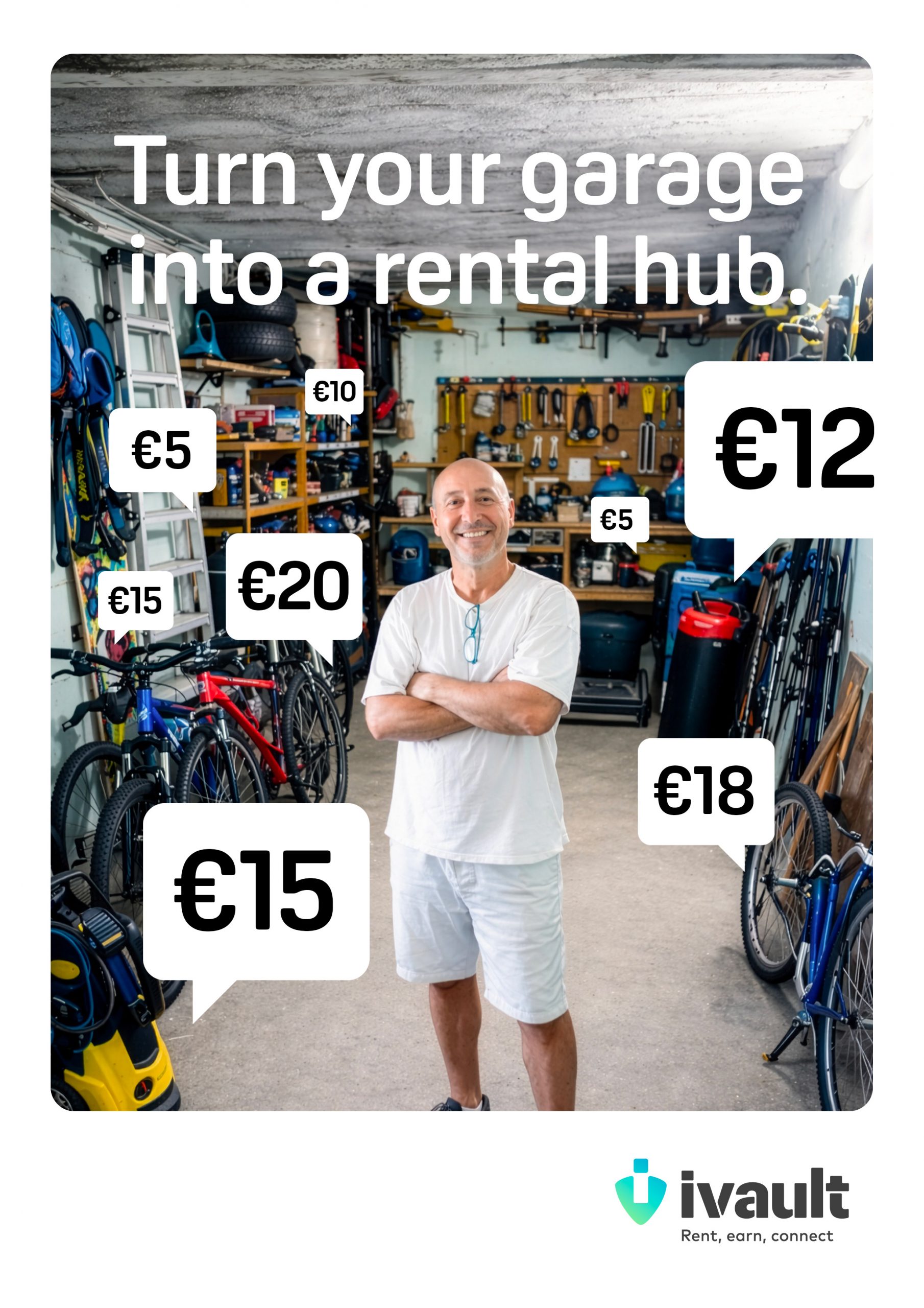
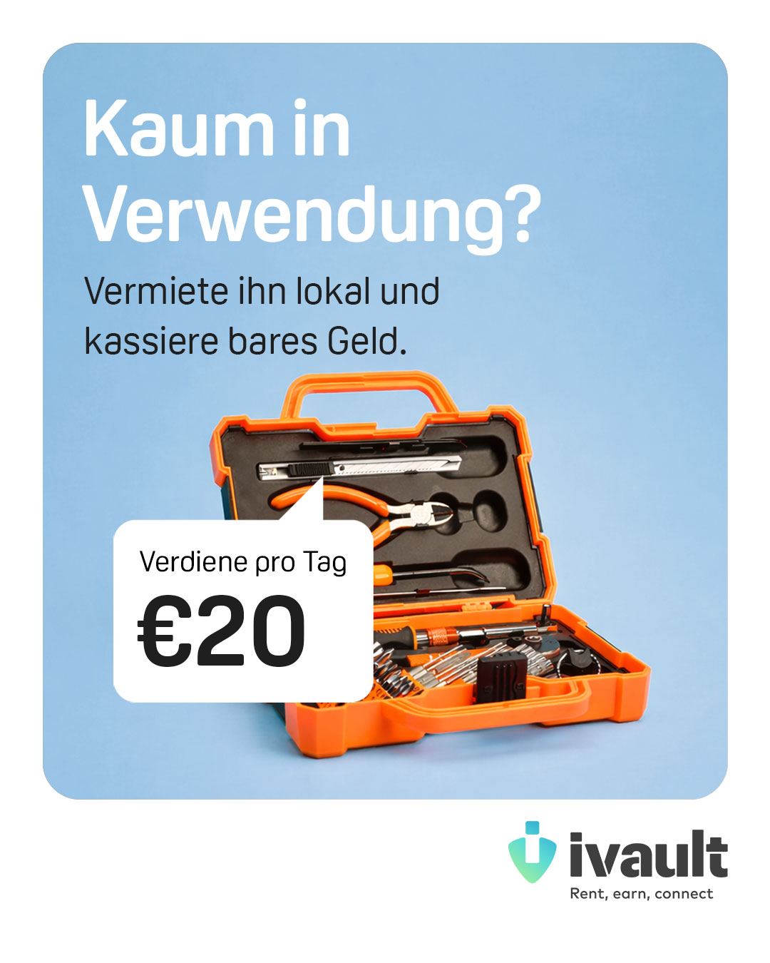
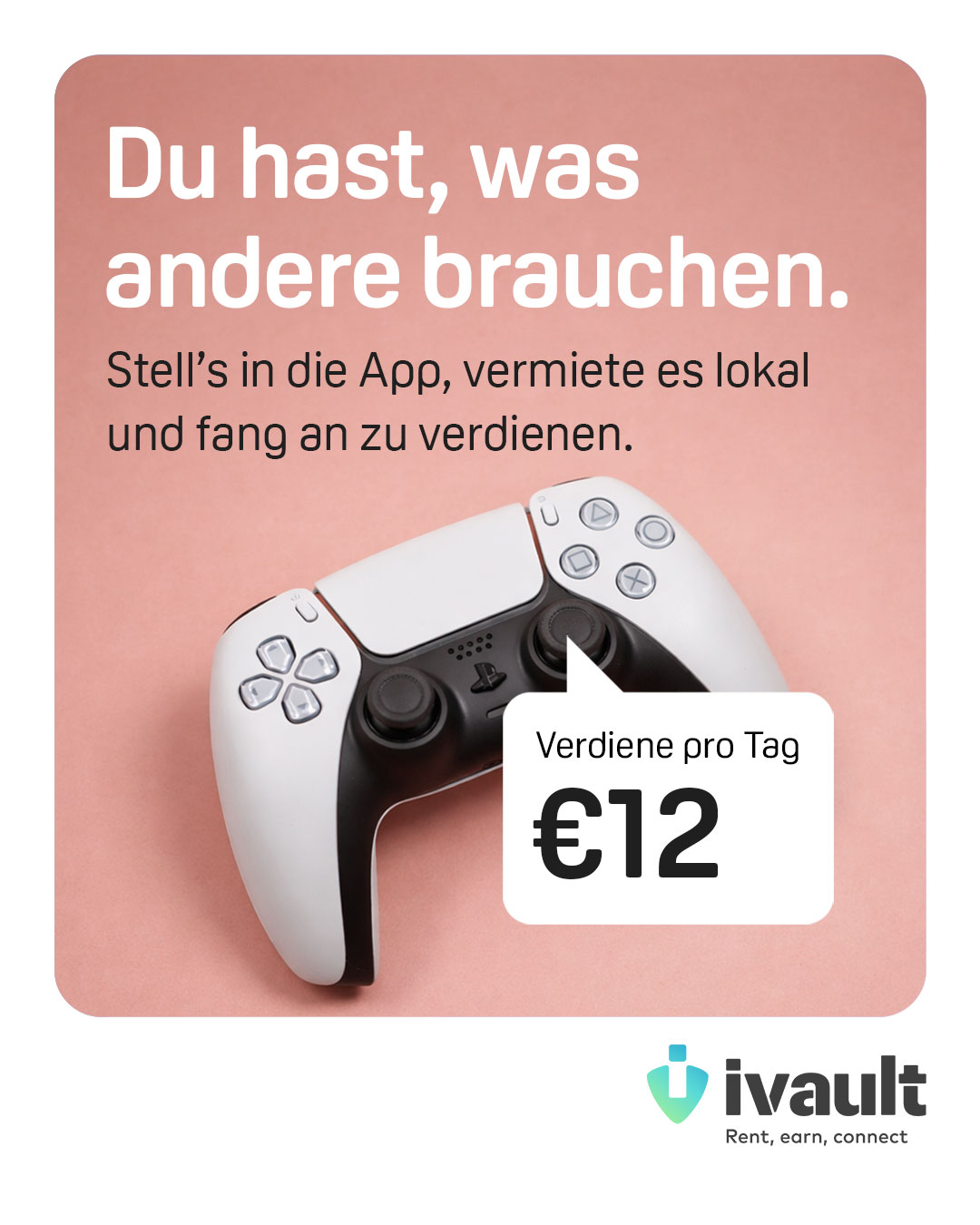
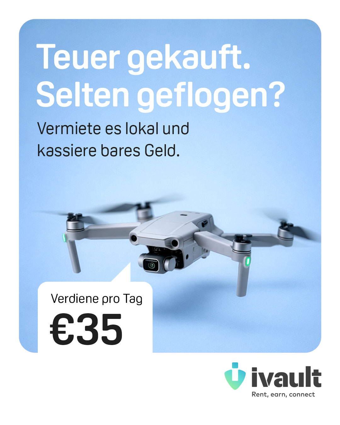
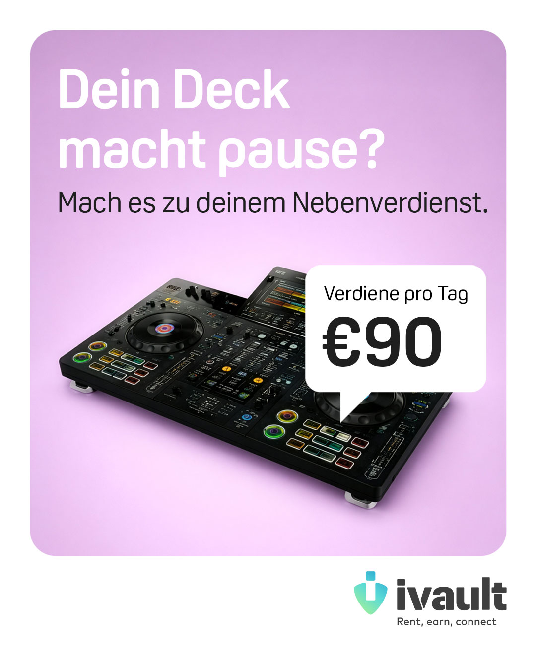
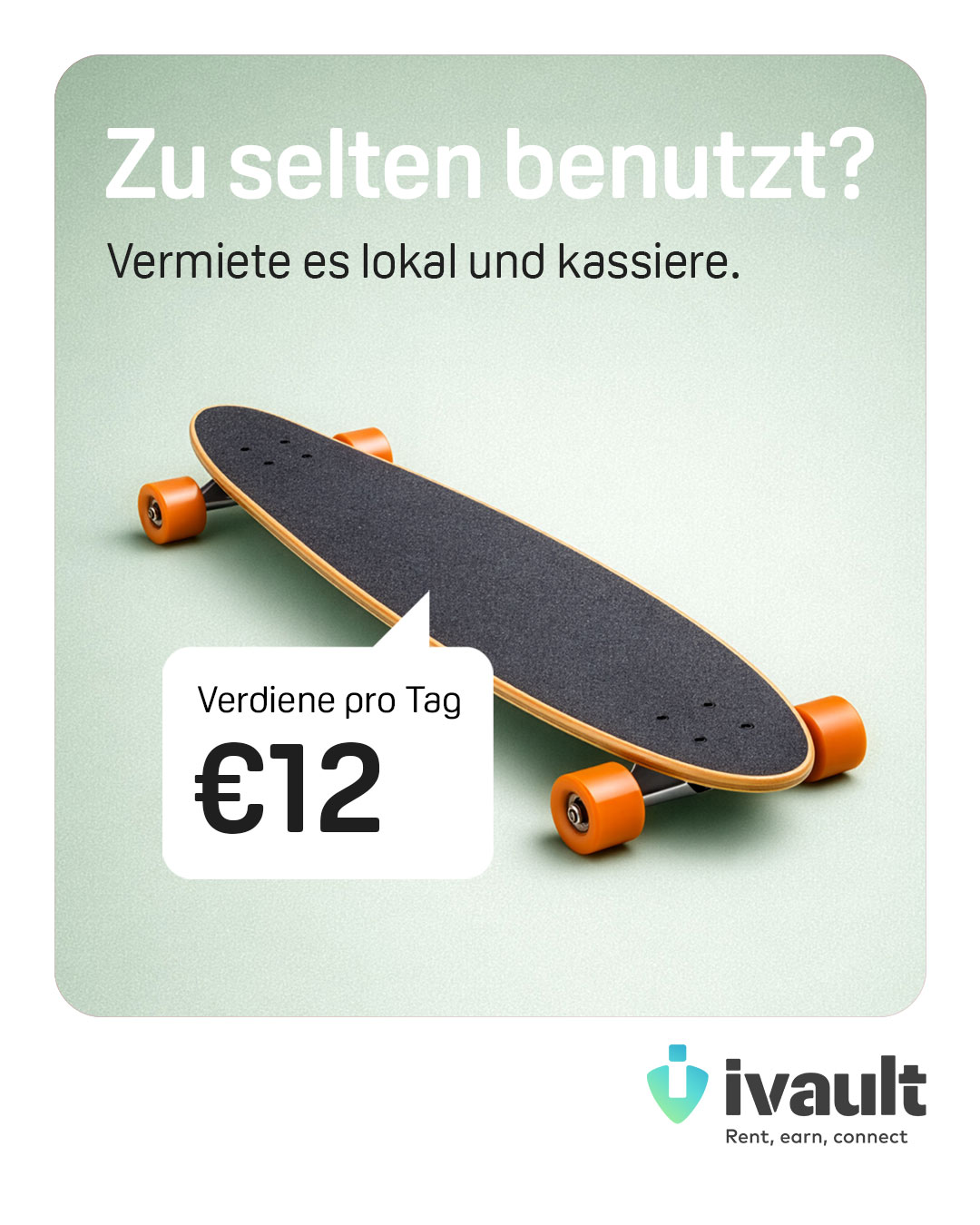
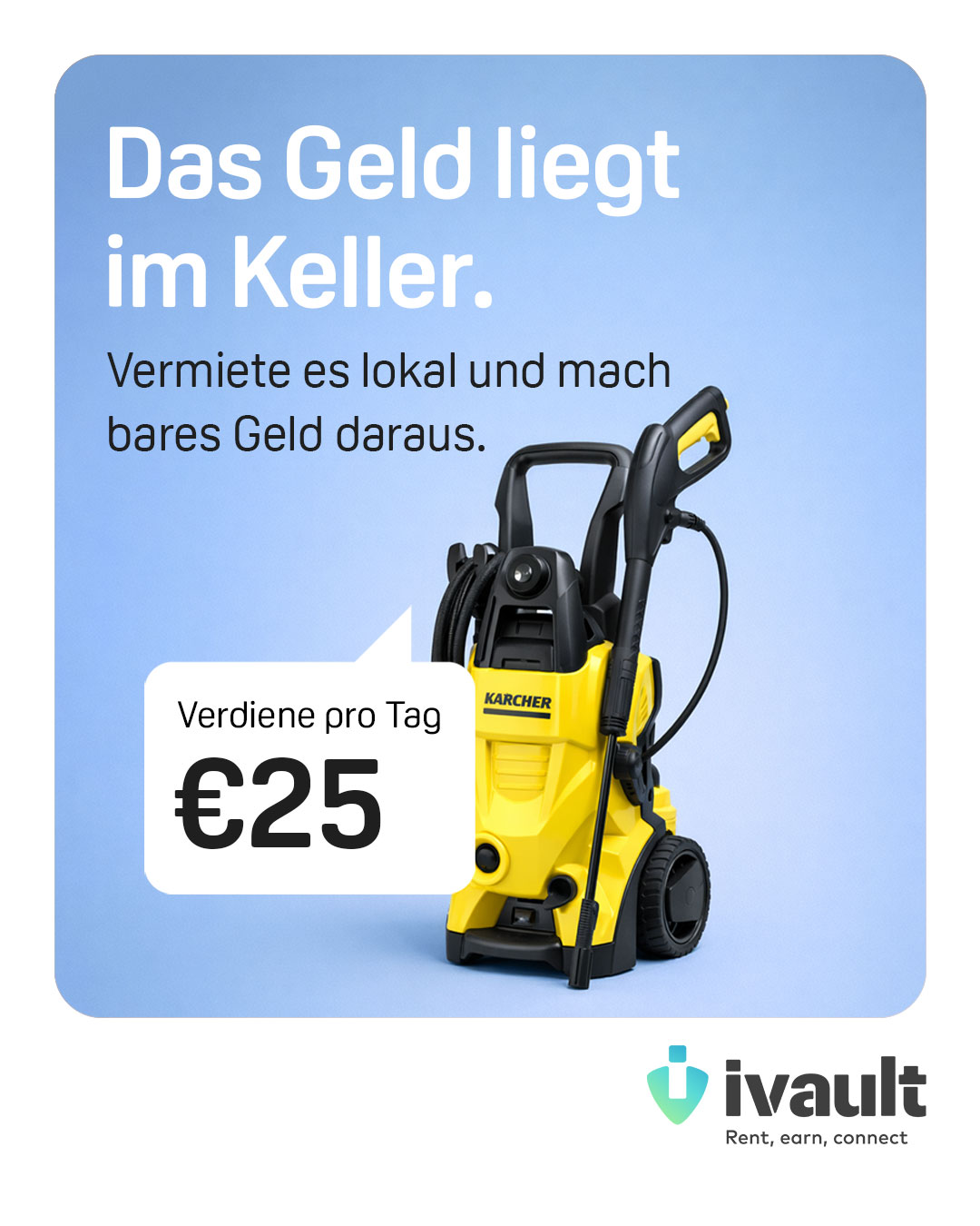
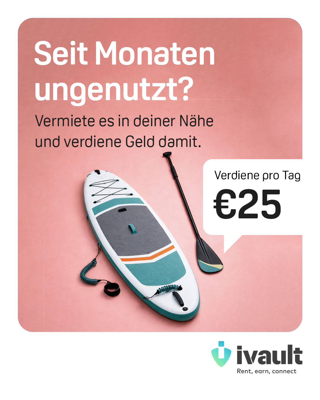
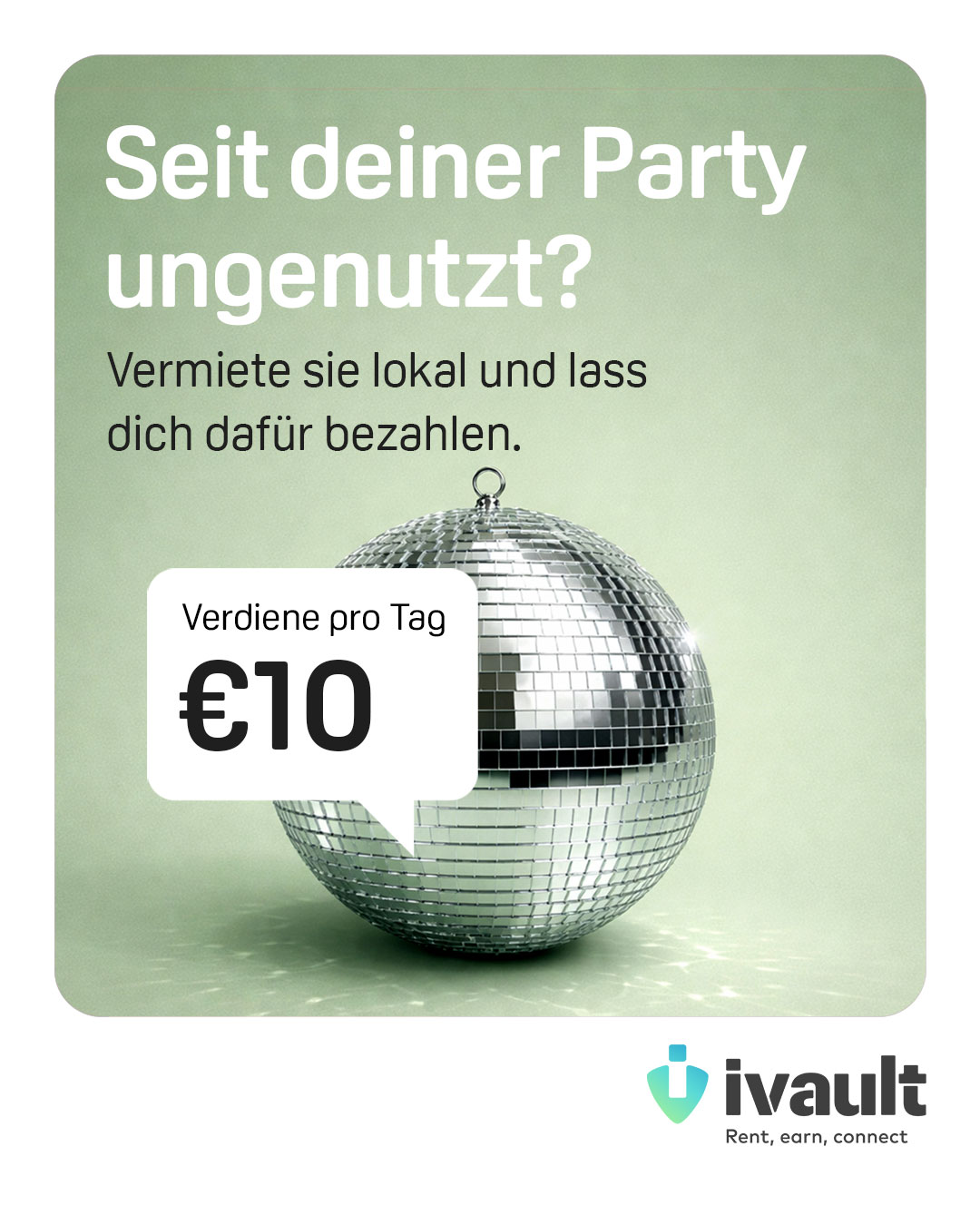
The world doesn’t need more stuff.
We need smarter ways to use what we already have.
ABCDEFGHIJKLMNOPQRSTUVWXYZabcdefghijklmnopqrstuvwxyz0123456789.,:;!?@#%&*()[]{}-_=+/\\|~^°€$£¥©®™
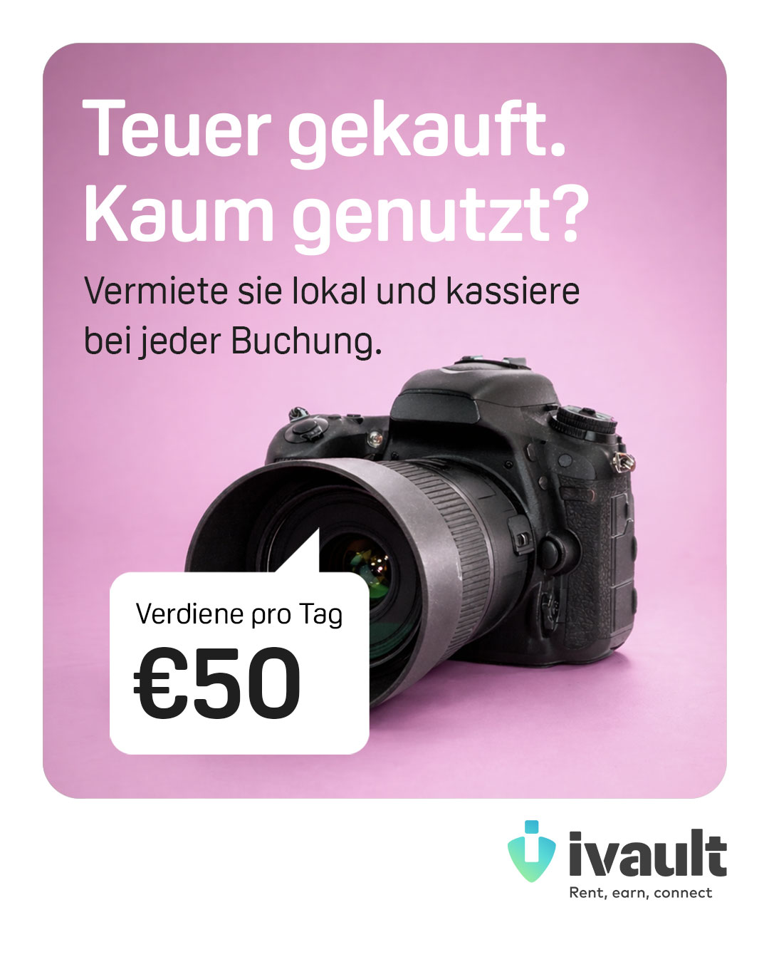
The world doesn’t need more stuff.
We need smarter ways to use what we already have.
ABCDEFGHIJKLMNOPQRSTUVWXYZabcdefghijklmnopqrstuvwxyz0123456789.,:;!?@#%&*()[]{}-_=+/\\|~^°€$£¥©®™
The world doesn’t need more stuff.
We need smarter ways to use what we already have.
ABCDEFGHIJKLMNOPQRSTUVWXYZabcdefghijklmnopqrstuvwxyz0123456789.,:;!?@#%&*()[]{}-_=+/\\|~^°€$£¥©®™
Oscine Comes in three weights: Light, Regular, Bold, including Italics
Supports multilingual characters: ready for most of the markets we operate in
Designed for clarity and consistency across mobile, desktop, and print
Works equally well in body copy and headlines


